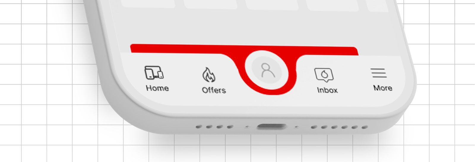
In mobile app design, a sticky tab bar is an essential navigation element that provides users quick access to an app’s primary sections. For a brand like Vodafone, a well-designed sticky tab bar ensures seamless user interaction and consistency with its visual identity.
This tutorial will guide you through the process of creating a sticky tab bar in Figma, from initial setup to adding interactive elements, ensuring a polished and functional design that enhances user experience.
Understanding the Vodafone App Sticky Tab Bar
Before we dive into the design process, let’s break down the key elements of a Vodafone app sticky tab bar:
- Position: Typically located at the bottom of the screen.
- Behavior: Remains fixed in position as the user scrolls.
- Content: Usually consists of icons representing different app sections or features.
- Style: Adheres to Vodafone’s color palette, typography, and overall design language.
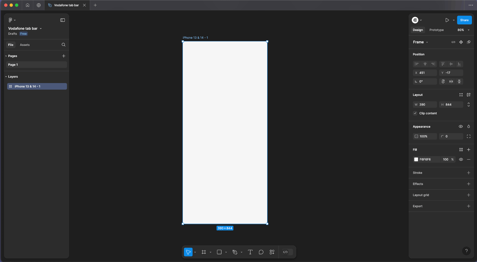
Step 1: Set Up the Artboard
- Open Figma and create a new file.
- Create a Frame:
- Press
Fand draw a frame on the canvas or choose a predefined device size from the right-hand panel (e.g., iPhone 13 , 14).
- Press
- Add Background Color:
- Select the frame.
- Open the right-hand panel, where you’ll find the “Fill” section.
- Click on the color swatch and input
#F6F6F6in the hex code field to set a light gray background color.
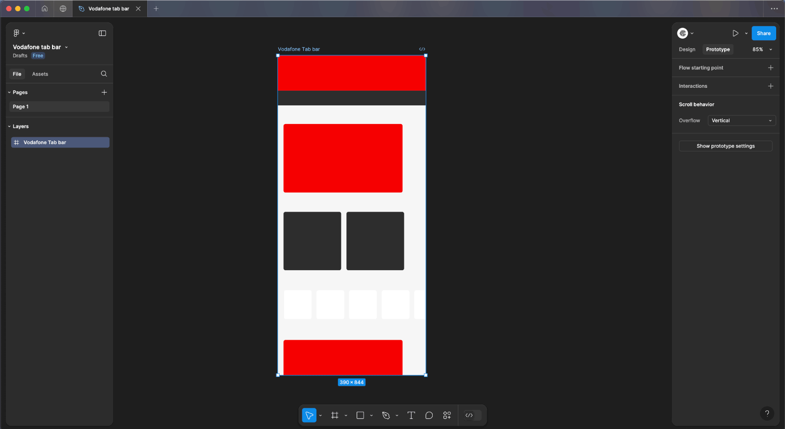
Step 2: Add Content and Enable Vertical Scrolling
- Import the Image:
- Use the image linked below and drag it into the frame.
- Position the image near the top of the frame, ensuring it fits within the width of the frame.
- Since the image is long, the total height of the content will exceed the height of the frame.
- Set the frame to clip content by selecting the frame, and in the right-hand panel, enable the “Clip Content” option.
- Enable Vertical Scrolling:
- Select the main frame.
- Click on the
Prototypetab at the top of the right-hand panel. - Change the
Overflow BehaviortoVertical Scrolling.
- Click Present and Watch the Scrolling Content:
- Click the
Presentbutton at the top-right corner to enter presentation mode. - Scroll through the content to observe the scrolling effect and ensure the content is correctly displayed.
- Click the
Step 3: Design the Tab Bar
- Create the Tab Bar Background:
- Select the
Rectangletool (R) and draw a rectangle at the bottom of your frame. - Set the dimensions of the rectangle to 80px width and 60px height.
- Set the background color to white by clicking on the color swatch in the right-hand panel and inputting
#FFFFFFin the hex code field. - With the rectangle selected, click on the bottom corners (left and right) to adjust their border radius.
- Set the border radius for the bottom corners to 36px to create rounded edges.
- Select the
- Draw a Triangle Using the Pen Tool:
- Select the
Pentool (P) from the toolbar. - Click on the canvas to create three points that form a triangle. Set the dimensions of the triangle to 32px width and 28px height.
- Close the path by clicking back on the first point.
- To ensure accuracy, you can adjust the size of the triangle using the properties panel after drawing it.
- Select the
- Add an Anchor Point and Adjust the Radius:
- With the triangle selected, choose the
Pentool (P) again or use theAnchor Pointtool. - Click on the middle of the base of the triangle to add an anchor point.
- Now, select this middle anchor point.
- In the right-hand panel, adjust the corner radius of this anchor point to 90px. This will create a curved, rounded bottom edge on the triangle.
- With the triangle selected, choose the
- Duplicate and Flip the Triangle:
- Select the triangle you just created.
- Press
Ctrl+D(Cmd+Don Mac) to duplicate the triangle. - With the duplicated triangle selected, right-click and choose
Flip Horizontalto mirror it. - Move the flipped triangle to the right side of the previous rectangle, aligning it symmetrically with the original triangle.
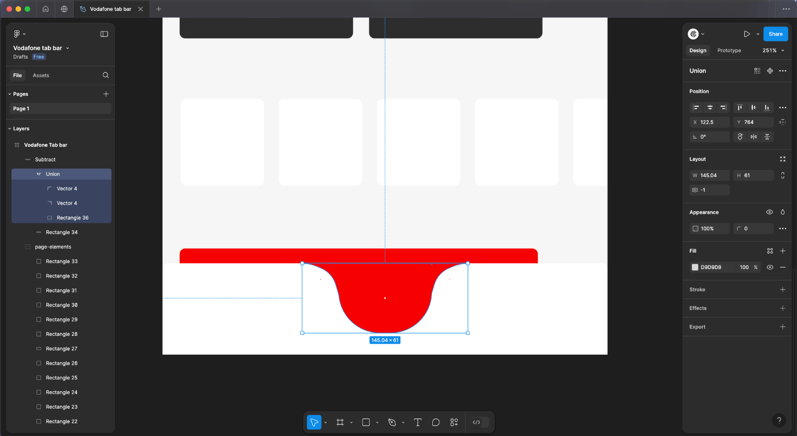
- Union the Shapes:
- Select the rectangle and both triangles by holding down the
Shiftkey and clicking on each shape. - In the top toolbar, click the
Union Selectionbutton (or pressCtrl+E/Cmd+E). - This action will combine the selected shapes into a single, unified vector shape.
- Select the rectangle and both triangles by holding down the
- Subtract the Shape from the Background:
- With the new unified shape selected, hold down the
Shiftkey and select the rectangle (background shape) behind it. - In the top toolbar, click the
Subtract Selectionbutton (or pressCtrl+-/Cmd+-). - This will subtract the new shape from the background, creating a cutout effect where the triangles were.
- With the new unified shape selected, hold down the
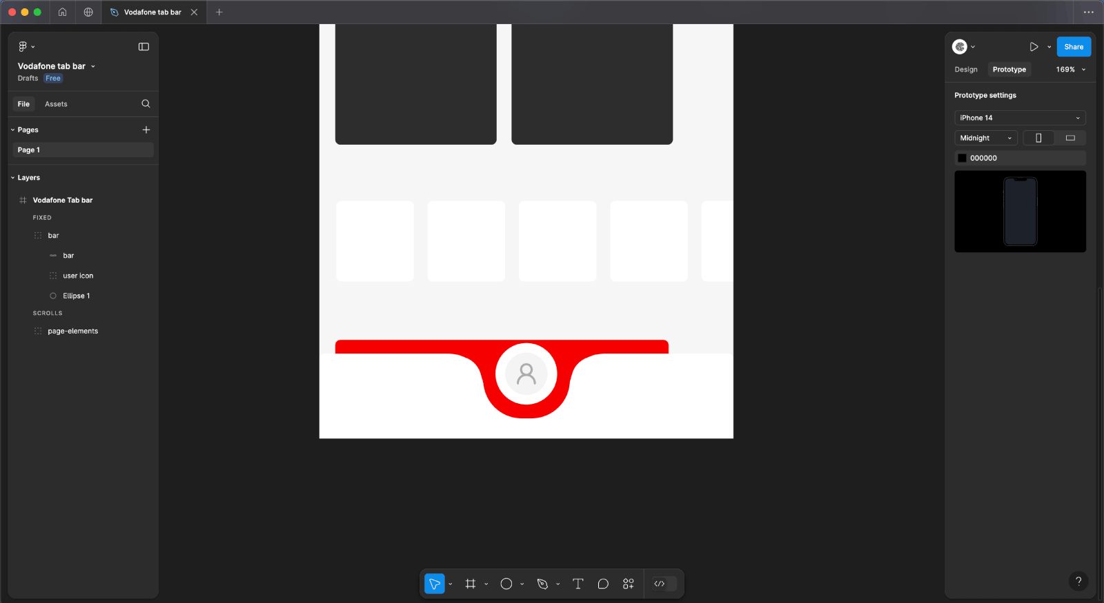
Step 4: Create and Position the Center User Icon
- Create the User Icon Background:
- Select the
Ellipsetool (O) from the toolbar. - Click on the canvas and draw a circle with a width and height of 40px.
- Set the fill color
#F4F4F4by selecting the color swatch in the right-hand panel and inputting the hex code.
- Select the
- Add the Border:
- With the circle still selected, go to the right-hand panel and find the
Strokesection. - Set the stroke width to 9px.
- Set the stroke color
#FFFFFFby clicking on the stroke color swatch and entering the hex code. - Ensure that the stroke position is set to “Outside” so that the border surrounds the outer edge of the circle.
- With the circle still selected, go to the right-hand panel and find the
- Open Iconify Plugin:
- Go to the
Pluginsmenu in Figma. - Select “Iconify” from the list of installed plugins. If it’s not installed, you can search for and install it from the Figma Community.
- Go to the
- Choose the User Icon:
- In the Iconify plugin window, use the search bar to type “user”.
- Browse the available user icons and select the one that fits your design needs.
- Click on the icon to insert it into your Figma file.
- Color the Icon:
- With the user icon selected, go to the right-hand panel.
- Set the fill color of the icon to
#ADADADby clicking on the color swatch and entering the hex code.
- Group and Center the Icon:
- Select both the circle background and the user icon by holding down the
Shiftkey and clicking on each element. - Right-click and choose “Group Selection” or press
Ctrl+G(Cmd+Gon Mac) to group them. - Move the grouped icon to the center of the tab bar.
- Select both the circle background and the user icon by holding down the
- Position the Icon in the Sticky Navigation:
- Ensure the tab bar is in a Fixed position by selecting the “Bar” shape.
- Adjust the position of the grouped icon to align it with the middle of the tab bar, ensuring it remains visible and centered.
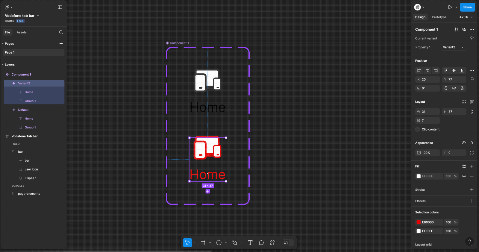
Step 5: Create and Configure Tab Item Components
-
- Create a Table for Tab Items:
- Add a new frame or rectangle inside the tab bar to act as a container for the tab items. This will help in organizing and positioning the tab items evenly.
- Create a Component for Tab Items:
- Select both the icon and the text label for one tab item.
- Right-click and choose “Create Component” or press Ctrl+Alt+K (Cmd+Option+K on Mac) to create a reusable component for the tab item.
- Add Variants to the Component:
- With the component selected, go to the right-hand panel and click the + icon next to Variants to add a new variant.
- Rename the default variant to “Inactive” and the new variant to “Active”.
- Customize the Active Variant:
- Select the “Active” variant.
- Click on the icon and text within this variant, and change their color to red #E60000 by selecting the color swatch and entering the hex code.
- Set Up Smart Animation:
- Switch to the Prototype tab in the right-hand panel.
- With the “Inactive” variant selected, click the circular node (Prototype handle) and drag a connection arrow to the “Active” variant.
- Set the interaction trigger to “On Click”.
- Choose “Navigate To” in the Action dropdown and select the “Active” variant.
- For the “Animation”, select “Smart Animate”.
- Set the Easing to “Ease Out” and adjust the Duration for smooth transitions.
- Add Icons and Text for Each Tab Item:
- Add Icons:
- For each tab item, use the Ellipse tool (O) to create a circle with a size of 32px.
- Use your custom-designed icons or appropriate icons from Iconify that match the app design. Ensure each icon is sized to fit well within the circle (approximately 32px).
- Add Text Labels:
- Below each icon, use the Text tool (T) to add a label.
- Set the font to Inter, size to 11px, and color to #000000.
- Position the text 7px above each icon by placing the text element at a vertical distance of 7px from the bottom edge of the icon.
- Add Icons:
- Position and Align Items:
- Distribute the icons and text evenly across the tab bar.
- Ensure each tab item is properly spaced and aligned for a clean and organized look.
- Test the Interaction:
- Click the Present button in the top-right corner to enter presentation mode.
- Interact with the tab items to ensure the smart animation works as expected when switching between the inactive and active states.
- Create a Table for Tab Items:
Save and Share
- Save: Don’t forget to save your work and enjoy!
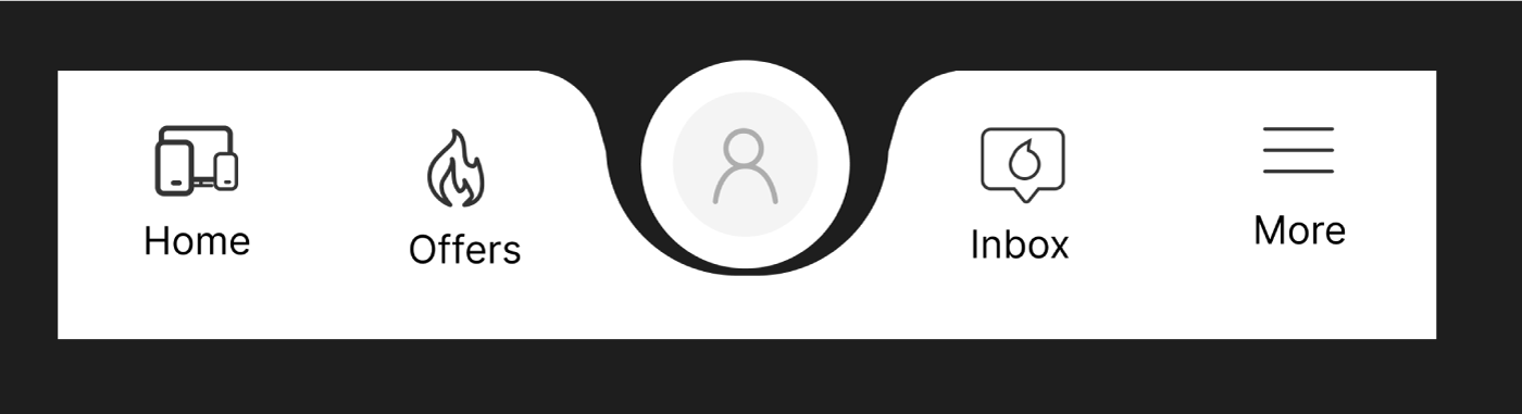
Final Result
Grab it!
