
In this tutorial, you’ll design a Material Design-inspired Floating Action Button (FAB) menu in Figma.
The main circular FAB will reveal four smaller, hidden FABs that radiate in a circular motion when hovered, creating a dynamic and interactive UI element.
Step 1: Set Up Your Canvas
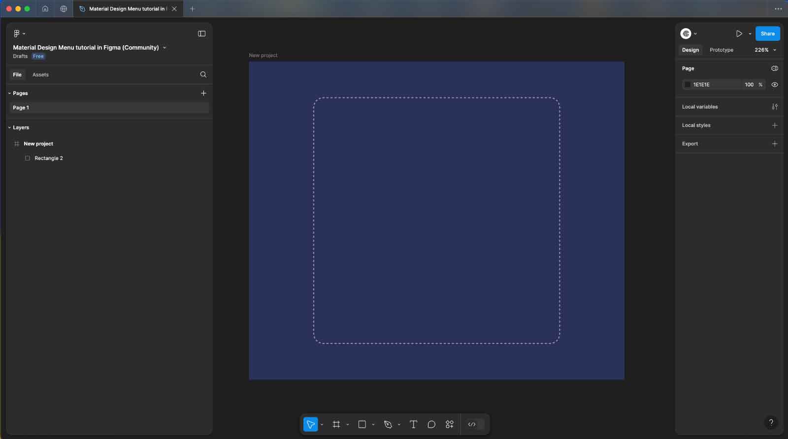
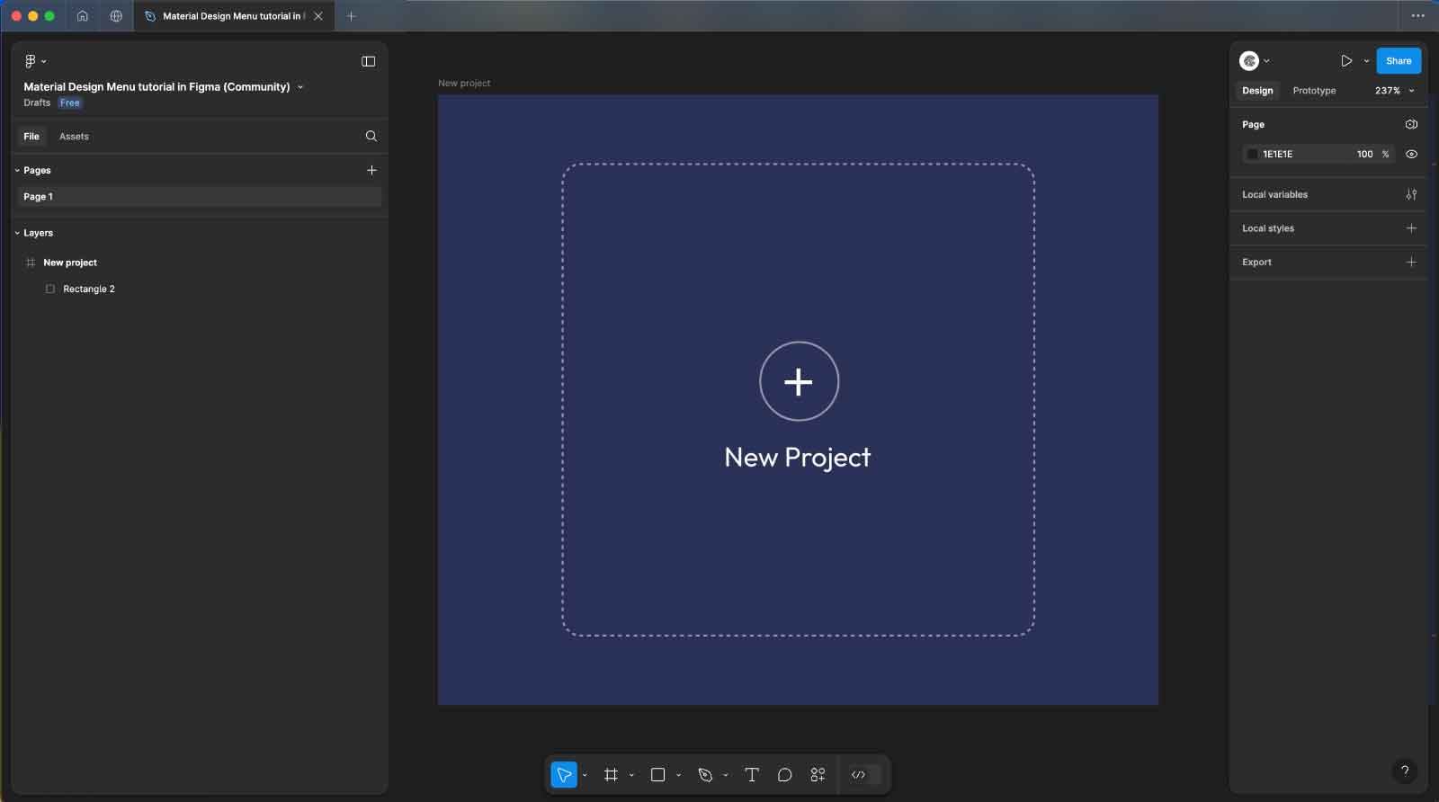
- Open Figma and create a new frame with the size
368x312px. - Set the background color of the frame to
#2A3158for a dark and modern look. - Use the Rectangle tool
Rto draw a rectangle on the frame. Apply the following properties to the rectangle:- Width: Match the frame’s size at 241x241px
- Border Radius: 10px
- Stroke: 2px
- Dash Pattern: 2
- Stroke Color:
#FFFFFF
This rectangle will define the interactive area where your FAB menu will reside.
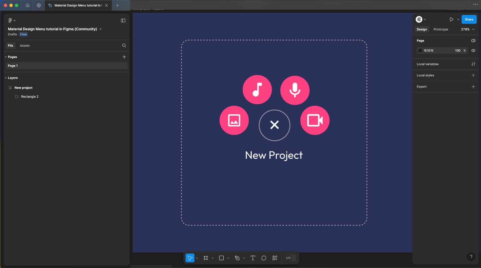
Step 2: Create the Main Circle Button
- Draw the Circle: Use the Ellipse tool
Oto create a circle with dimensions 41x41px, positioning it in the center of the frame. - Style the Circle: Set the stroke color of the circle to
#9598ABand the background color to#2A3158. - Add the Plus Icon: Utilize the Iconify plugin to insert a 14x14px plus
+icon within the circle. Make sure the icon is perfectly centered. - Center Align: Select both the circle and the plus icon, then use the Align Center and Align Middle options to ensure the icon is centered within the circle.
- Add Text Label: Below the circle, add a text label that reads “New Project” using the Text tool
T.- Set the font to Outfit.
- Set the font size to 14px.
- Align the text centrally beneath the circle.
This button will function as the main FAB, with the text label indicating the action it represents.
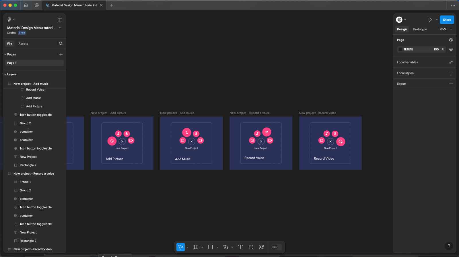
Step 3: Create the Four Expanding FAB Buttons and Add Text Labels
- Draw the FAB Buttons: Use the Ellipse tool
Oto create four circles, each with a size of 37x37px. - Style the Buttons: Set the background color of each circle to #FF4182.
- Add Icons to Each Button: Using the Iconify plugin, add icons sized 20x20px in the center of each circle. Set the icon color to #FFFFFF.
- Button 1: Add an image icon.
- Button 2: Add a music icon.
- Button 3: Add a mic icon.
- Button 4: Add a video icon.
- Arrange the Buttons Around the Main Circle: Position the four buttons in a circular formation around the main plus button:
- Button 1 (Image): Place it directly above the main button.
- Button 2 (Music): Place it to the right of the main button.
- Button 3 (Mic): Place it directly below the main button.
- Button 4 (Video): Place it to the left of the main button.
- Create a Frame for Text Labels:
- At the bottom of your design, create a new frame with dimensions 168x49px.
- Inside this frame, add four text labels: “Add Picture”, “Add Music”, “Record Voice”, and “Record Voice” (ensure each action is correctly labeled).
- Set the text properties for each label:
- Font Size: 20px
- Font Family: Outfit
- Text Color: #FFFFFF
- Stack the text labels on top of each other within this frame. Move the entire frame downwards so that the text labels are not visible within the main frame’s viewport, hiding them initially.
By organizing the buttons in a circular pattern around the main FAB and using a separate frame for the text labels, which are hidden initially, you set the stage for an intuitive interaction. This structure allows for a clean and focused initial view while providing the necessary text labels to indicate each button’s action during the hover states.
Step 4: Create the Initial and Hover States
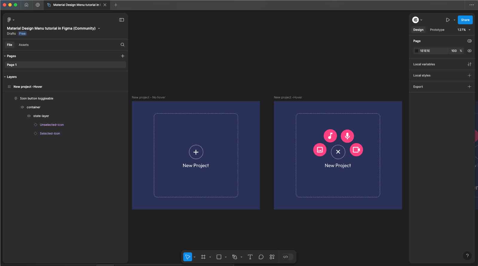
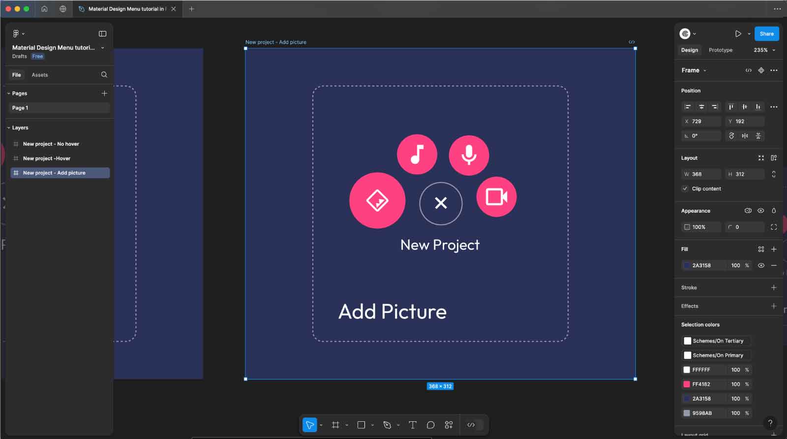
Step 5: Create the First Hover State for the “Add Image” Icon
- Duplicate the Hover Frame: Start by duplicating the hover frame where all four buttons are arranged in a circular pattern around the main FAB.
- Reveal the “Add Picture” Text: Move the “Add Picture” text label up slightly within the new frame so that it becomes visible. Position it just below the image icon button to indicate its associated action. This change will create a hover effect that shows the text label only when the image button is hovered over.
- Resize and Rotate the Image Button:
- Increase the size of the first button (the one with the image icon) to 53x53px.
- Rotate the image button by 45 degrees to add a dynamic visual cue indicating the active state.
By moving the “Add Picture” text label up so it’s visible within the frame, you’ll provide users with a clear visual cue about the action associated with the image button when they hover over it. This step enhances the interactive experience, making the hover state informative and visually appealing.
Step 6: Step 6: Create Hover States for the Remaining Buttons
- Duplicate the Frame for Each Hover State: For each of the other buttons (music, mic, and video), create a new frame by duplicating the existing hover frame.
- Show the Text Labels: Move the corresponding text label for each button slightly upwards to make it visible within the frame. This will serve as the hover effect for each button:
- For the music button, move the “Add Music” text label up so it’s visible under the music icon.
- For the mic button, move the “Record Voice” text label up so it’s visible under the mic icon.
- For the video button, move the “Record Voice” text label (or the correct label) up so it’s visible under the video icon.
- Adjust Button Size and Rotation:
- Increase the size of each hovered button to 53x53px.
- Rotate each button by 45 degrees and -45 degrees to match the dynamic appearance set in Step 5.
Repeat this process for each button, creating a separate frame for each hover state. By revealing the text labels and enlarging the icons with a slight rotation, you’ll create clear and engaging hover states that guide users through the available actions in a visually appealing way.
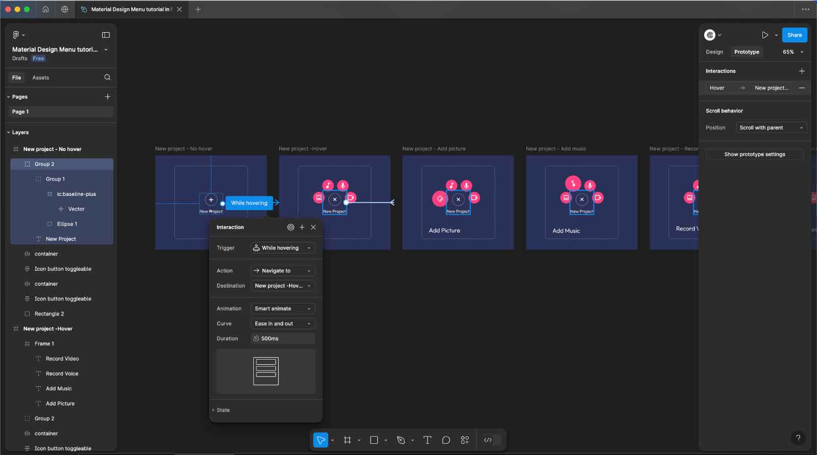
Step 7: Add Interactivity with Hover Animations
- Switch to Prototype Mode: In Figma, switch to Prototype mode by clicking on the Prototype tab at the top of the interface.
- Set Up Hover Interactions: Select the main frame where the buttons are hidden under the main FAB (the non-hover state). Click on the main FAB circle, then drag the interaction handle (the blue dot) to the hover frame where the buttons are expanded.
- Choose Hover Trigger: In the interaction details panel that appears on the right, set the following options:
- Trigger: Select Hover.
- Action: Choose Navigate to the hover frame.
- Animation: Select Smart Animate.
- Easing: Set to Ease In and Ease Out.
- Duration: Set to 500ms.
- Link Other Frames for Hover States: Repeat the same process for each individual button. Create hover states for each button (image, music, mic, and video) by linking them to their respective hover frames where the text is revealed, and the button is enlarged and rotated.
- Preview the Interaction: Click on the Play button in the upper-right corner to preview the prototype. Hover over the main FAB and each button to see the smooth transition effects and interactions.
By adding these hover interactions with smart animations, you’ll create a dynamic, user-friendly experience that clearly communicates the available actions and provides a seamless interaction flow.
Step 8: Save and Share Your Work
- Save Your Work:
- Make sure to save your Figma file to ensure all your changes are recorded. Click on File in the top-left corner and select Save or simply use the keyboard shortcut
Cmd + S(Mac) orCtrl + S(Windows).
- Make sure to save your Figma file to ensure all your changes are recorded. Click on File in the top-left corner and select Save or simply use the keyboard shortcut
- Share Your Prototype:
- To share your interactive prototype, click on the Share button in the upper-right corner of the Figma interface.
- Adjust the sharing settings as needed. You can set permissions to view or edit and choose whether to share with specific people or generate a public link.
- Copy the link or enter the email addresses of collaborators and set their access level.
- Publish the Prototype:
- If you want to make your prototype publicly accessible, you can publish it by selecting Get Embed Code or Share Prototype options to obtain an embed link or QR code for easy access.
- Review and Test:
- Before finalizing, review and test the interactive elements in your shared prototype to ensure everything functions as expected.
By saving and sharing your work, you ensure that your prototype is accessible to stakeholders, team members, or clients for feedback and further development.
