
Creating Illustrations Using Basic Shapes in Figma: A Step-by-Step Guide
Today, we will learn how to create this lovely illustration inspired by Freepik using only Figma’s basic shape tools. Whether you’re a beginner or an experienced designer, this guide will show you how to transform simple geometric shapes into a charming and detailed illustration.
Step 1: Getting to Know Figma’s Basic Shape Tools
Before diving into the illustration, it’s important to familiarize yourself with Figma’s basic shape tools, which include:
- Rectangle Tool
R: Ideal for creating squares and rectangles. - Ellipse Tool
O: For drawing circles and ovals. - Line Tool
L: Useful for straight lines and dividing shapes. - Polygon Tool
Shift + PR: Allows for the creation of polygons with adjustable sides. - Star Tool
Shift + R: Creates stars with customizable points. - Arrow Tool
Shift + L: For adding directional arrows.
These tools are your building blocks for creating more complex designs.

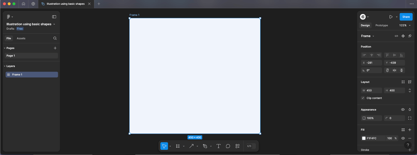
Step 2: Set Up Your Canvas
- Open Figma: Fire up Figma and start a new file or open one you already have.
- Create a Frame: Hit
Fto draw a frame sized 450px by 400px with a give it a #F1F4FC background color.
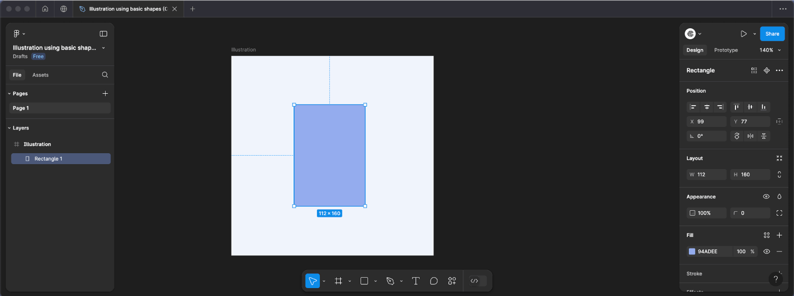
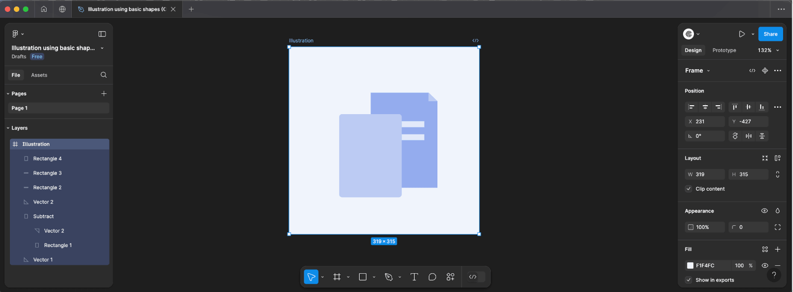
Step 3: Create the first element, the File
Step 3.1: Setting Up the File Icon Background
- Draw the Rectangle:
- Select the Rectangle Tool
Rfrom the toolbar. - Click on the canvas and draw a rectangle with a width of 112px and a height of 160px.
- Position the rectangle where you’d like your file icon to be.
- Select the Rectangle Tool
- Apply the Background Color:
- With the rectangle selected, navigate to the Fill option in the properties panel on the right.
- Input the color code
#94ADEEto give the rectangle a pleasant blue hue.
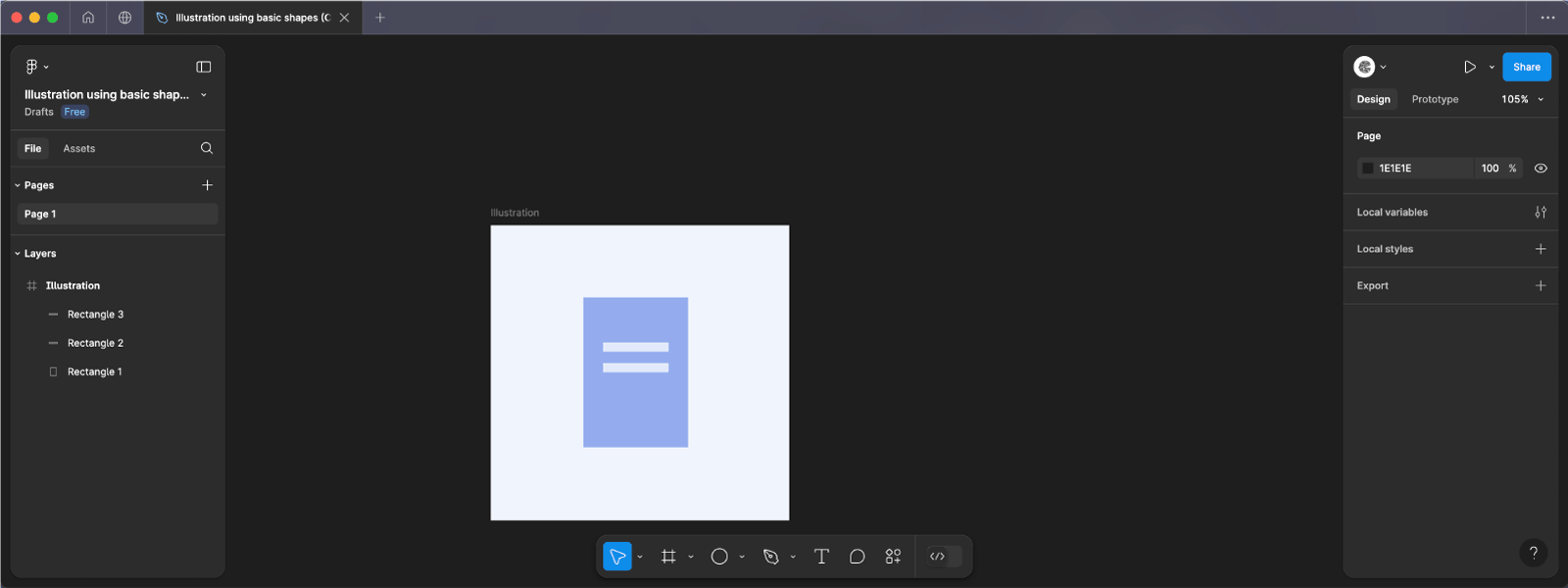
Step 3.2: Designing the Text Lines
- Create the First Text Line:
- Using the Rectangle Tool
Rdraw a smaller rectangle with a width of 70px and a height of 10px. - Position this rectangle towards the upper part of the file icon to represent a line of text.
- Using the Rectangle Tool
- Apply the Text Line Color:
- Select the new rectangle and set its Fill color to
#E2E9FA, providing a light contrast against the background.
- Select the new rectangle and set its Fill color to
- Duplicate and Position the Second Text Line:
- With the text line rectangle selected, press
Ctrl + D,(Cmd + D on Mac)to duplicate it. - Use the Down Arrow Key to nudge the duplicated rectangle 10px below the first, ensuring consistent spacing.
- With the text line rectangle selected, press
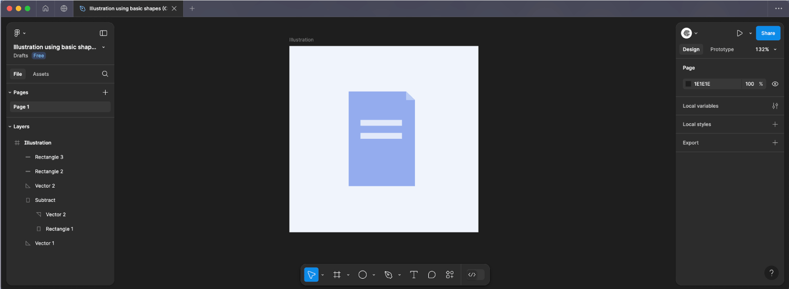
Step 3.3: Crafting the File’s Folded Corner
- Draw the Triangle for the Fold:
- Select the Pen Tool
(P)from the toolbar. - Click on the canvas to plot three points, forming a right-angled triangle with sides measuring 14px.
- This triangle will represent the folded corner of the file.
- Select the Pen Tool
- Duplicate and Rotate the Triangle:
- Select the triangle and duplicate it using
Ctrl + D,(Cmd + D on Mac). - With the duplicated triangle selected, rotate it by 180°. This can be done by dragging the rotation handle or inputting 180 in the rotation field of the properties panel.
- Select the triangle and duplicate it using
- Intersecting Shapes to Create the Fold:
- Select both the file background rectangle and the rotated triangle.
- Navigate to the top toolbar and click on Intersect Selection (the icon resembling two overlapping squares with the overlapping area highlighted).
- This operation will carve out a folded corner effect on the file background.
- Positioning the Original Triangle:
- Take the original triangle and place it precisely over the top-right corner of the file icon.
- Ensure it aligns perfectly to enhance the folded appearance.
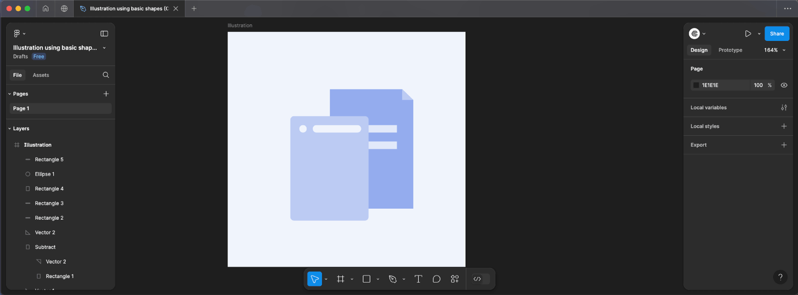
Step 4: Create the Second Element, the Image
Now that we’ve created the file icon, let’s move on to designing the image element. This part of the tutorial will guide you through building a simple image representation using basic shapes in Figma.
Step 4.1: Creating the Image Background
- Draw the Rectangle:
- Select the Rectangle Tool
Rand draw a rectangle with a width of 105px and a height of 140px. - This will serve as the background of your image icon.
- Select the Rectangle Tool
- Apply the Background Color and Border Radius:
- With the rectangle selected, set the Fill color to
#BBCBF4for a soft blue shade. - Add a border-radius of 5px to give the corners a smooth, rounded appearance.
- With the rectangle selected, set the Fill color to
Step 4.2: Adding the First Circle
- Draw a Small Circle:
- Use the Ellipse Tool
Oto draw a circle with a 10px diameter. - This will act as a decorative element on the image background.
- Use the Ellipse Tool
- Apply the Circle’s Background Color:
- Set the Fill color of the circle to
#F1F4FC, providing a light contrast against the background.
- Set the Fill color of the circle to
- Position the Circle:
- Move the circle 8px from the left edge of the image background to position it neatly within the design.
Step 4.3: Creating the First Rectangle
- Draw a Thin Rectangle:
- Draw another rectangle with a width of 65px and a height of 10px.
- This rectangle represents a smaller part of the image, such as a line of text or a border within the image.
- Apply the Background Color and Border Radius:
- Set the rectangle’s Fill color to
#F1F4FC. - Add a border radius of 5px to match the smooth corners of other elements.
- Set the rectangle’s Fill color to
- Position the Rectangle:
- Align the rectangle 8px from the right edge of the image background to create balance with the circle on the left.
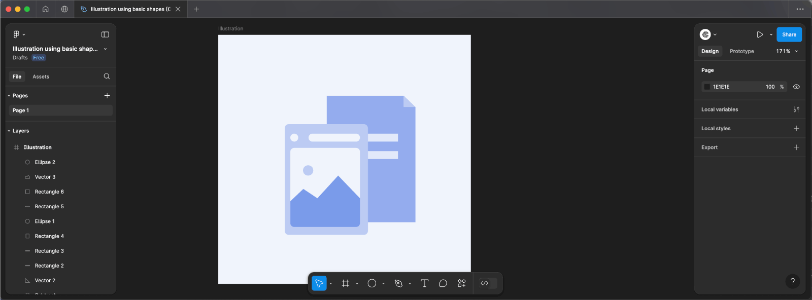
Step 4.4: Adding the Main Image Rectangle
- Draw the Main Image Area:
- Create another rectangle with a width of 88px and a height of 100px. This will represent the main content area of the image icon.
- Apply the Background Color and Border Radius:
- Set the Fill color to
#F1F4FCfor a consistent, cohesive look. - Apply a border radius of 5px to match the other elements.
- Set the Fill color to
- Position the Rectangle:
- Place the rectangle 10px below the previously added circle and small rectangle to create a neat and organized layout.
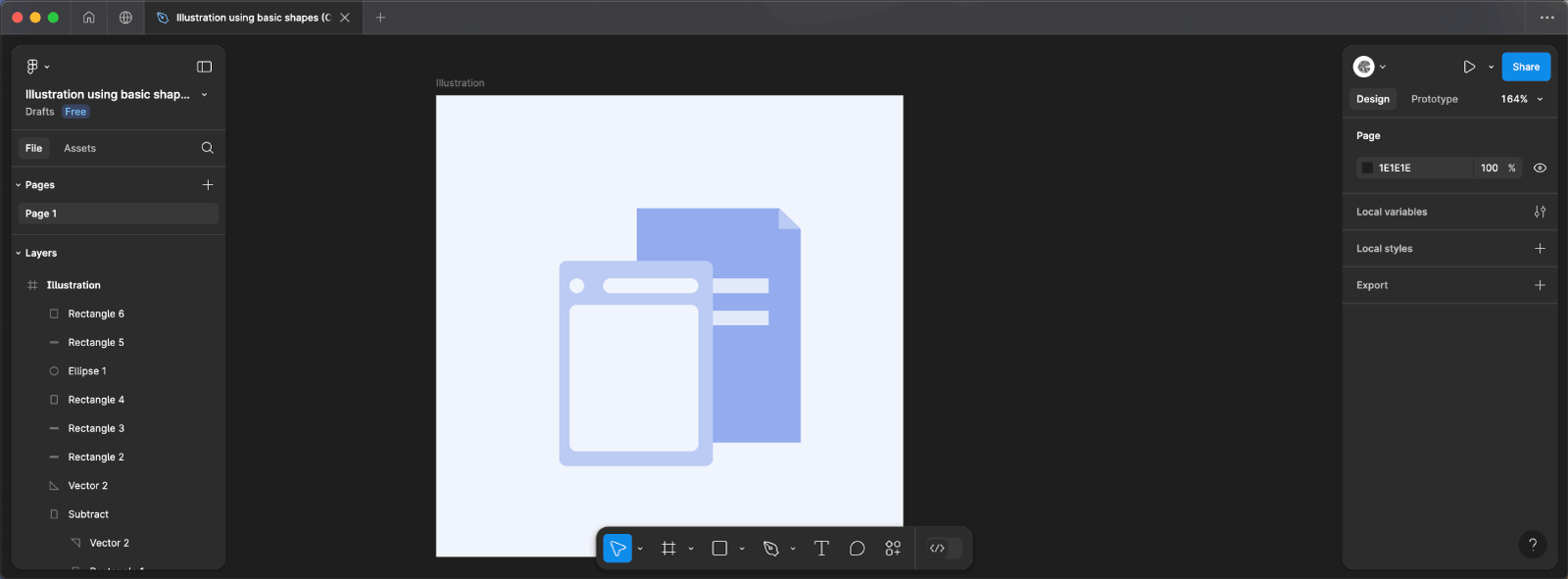
Step 4.5: Adding Decorative Elements
- Draw the Triangles and Rectangle:
- Use the Pen Tool
Pto draw two triangles and one rectangle, arranging them as shown in the illustration below. These shapes will add decorative details to the image icon.
- Use the Pen Tool
- Apply the Fill Color and Border Radius:
- Set the Fill color of the shapes to
#6B8FE8for a vibrant contrast. - Select the bottom corners of the shapes and add a border-radius of 5px to soften the design.
- Set the Fill color of the shapes to
- Draw the Final Circle:
- Create a circle with a diameter of 13px using the Ellipse Tool (O).
- Set the Fill color to
#BBCBF4and position it within the design to add a finishing touch.
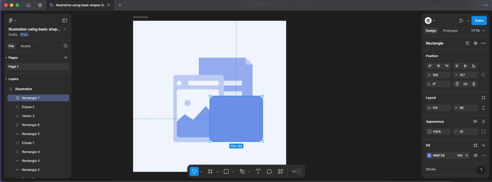
Step 5: Create the Third Element, the User ID
Step 5.1: Creating the User ID Background
- Draw the Rectangle:
- Select the Rectangle Tool
Rand draw a rectangle with a width of 110px and a height of 95px. - This will serve as the background for your user ID icon.
- Select the Rectangle Tool
-
- Set the rectangle’s Fill color to
#6B8FE8, a bold and vibrant shade. - Add a border-radius of 10px to create smooth, rounded corners.Apply the Background Color and Border Radius:
- Set the rectangle’s Fill color to
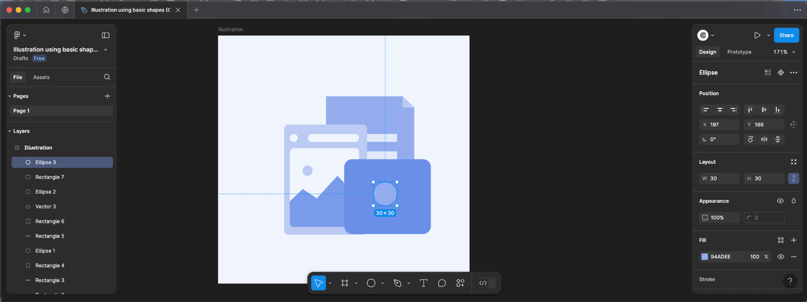
Step 5.2: Creating the User’s Head
- Draw the Head Circle:
- Use the Ellipse Tool
Oto create a circle with a 30px diameter. This circle represents the head of the user in the ID icon.
- Use the Ellipse Tool
- Apply the Fill Color:
- Set the circle’s Fill color to
#94ADEE, providing a soft contrast against the background.
- Set the circle’s Fill color to
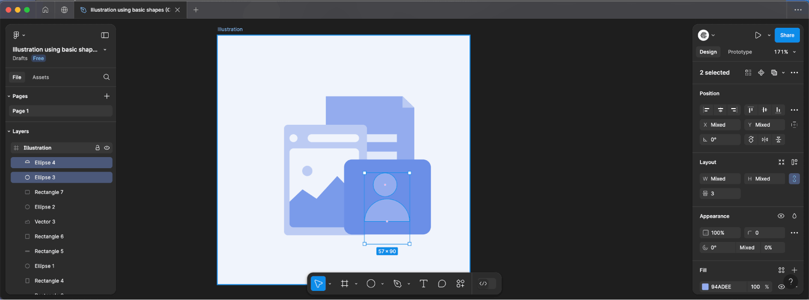
Step 5.3: Creating the User’s Body
- Draw the Body Circle:
- Draw another circle using the Ellipse Tool
Owith a 57px diameter. This circle will represent the user’s body.
- Draw another circle using the Ellipse Tool
- Position and Modify the Body Circle:
- Nudge the larger circle down so that it aligns just below the smaller circle (the head).
- Adjust the arc and sweep of the larger circle by dragging the arc handles or manually setting the sweep to -50%. This will give you a half-circle shape, representing the shoulders of the user.
- Group the Head and Body:
- Select both circles (the head and the half-circle body) and group them by pressing
Ctrl + G,Cmd + G on Mac.
- Select both circles (the head and the half-circle body) and group them by pressing
- Center the Group:
- With the group selected, center it within the background rectangle. This ensures that the user icon is perfectly aligned.
Step 6: Creating the Stars
Step 6.1: Drawing the First Star
- Select the Star Tool:
- Go to the Shapes Menu in Figma and select the Star Tool.
- Set the Star Count:
- In the properties panel, set the count to 4 to create a four-pointed star.
- Draw the Star:
- Click on the canvas and draw a star with dimensions of 21px by 21px.
- This star will serve as a decorative element in your design.
- Apply the Fill Color:
- With the star selected, set the Fill color to
#BBCBF4for a soft, complementary tone.
- With the star selected, set the Fill color to
Step 2: Duplicating the Stars
- Duplicate the Star:
- Select the star you just created and duplicate it by pressing
Ctrl + D,Cmd + D on Mac.
- Select the star you just created and duplicate it by pressing
- Position the Duplicate Stars:
- Adjust the positions of the duplicated stars to fit your design. You can arrange them in any way that enhances the visual appeal of your illustration.
- Duplicate Again:
- Repeat the duplication process one more time so that you have a total of three stars in your design.

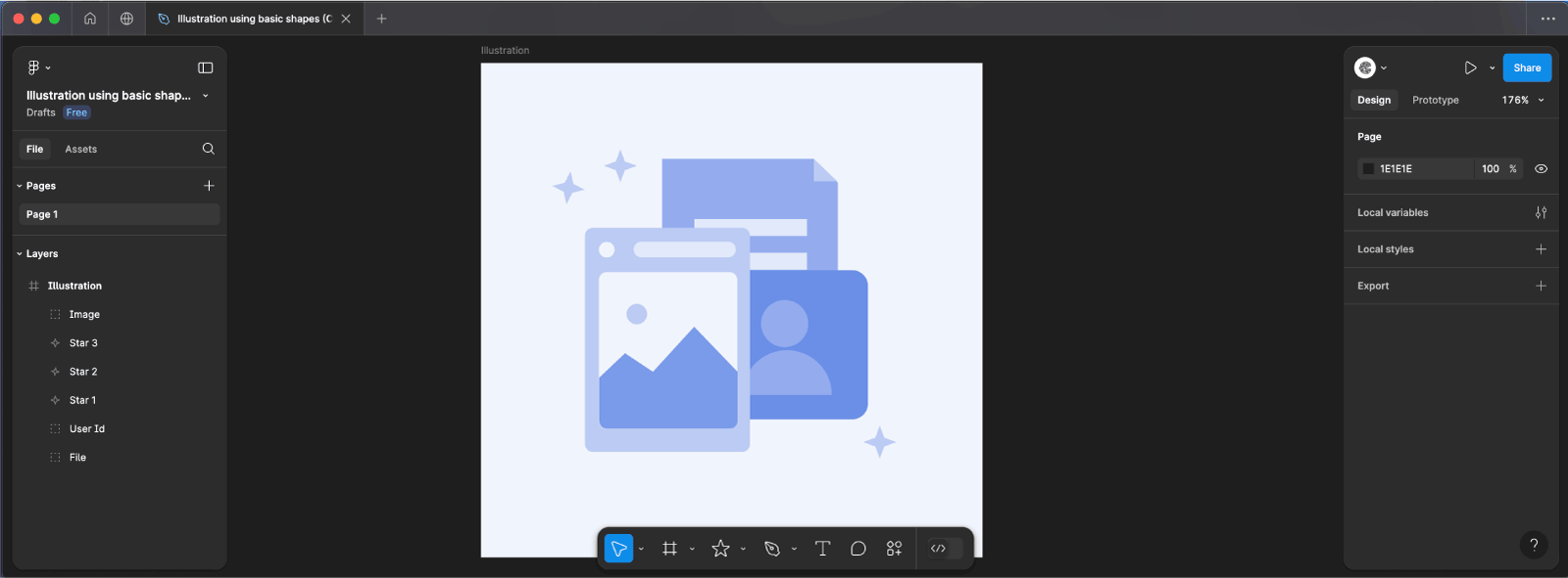
Final Step: Arrange Your Elements
Now that you’ve created all the elements—stars, User ID, image, and file—it’s time to bring them together in a final composition. The arrangement of these elements is up to your creative vision, but here’s how I arranged mine:
Step 1: Positioning the Elements
- Place the File Icon:
- Start by positioning the file icon on your canvas. This will serve as a foundational element in your illustration.
- Position the Image Icon:
- Next, place the image icon near the file icon. Depending on your desired layout, you might want to align the tops or place them side by side.
- Position the User ID Icon:
- Position the User ID icon about the file and image icons. Place it above, below, or to the side—whichever best fits your overall design.
- Add the Stars:
- Finally, arrange the stars around the other elements to add a decorative touch. You can place them in corners, alongside the icons, or even create a border effect.
Save and Share
- Save: Don’t forget to save your work!
- Export: Select your design, click
Exportin the right panel, choose your format (PNG, SVG, etc.), and hitExportand Enjoy!
