[uh-fawrd-ns] (n)
What It Means
In the UX world, affordance refers to those little clues in your design that scream, “Hey, click me!” or “Swipe here!” without the need for a tutorial.
It’s all about how a design element’s look or feel gives users the lowdown on how to use it.
Imagine you’re in a video game and come across a shiny, glowing button. You instantly know you’ve got to press it, right? That’s affordance in action!

 Affordance refers to the design element’s inherent or perceived properties that indicate how it should be used.
The visual or interactive clue tells users what an object can do, allowing them to understand its function without needing instructions.
Why It Matters
Affordances are critical in creating seamless user experiences.
When users encounter a well-designed affordance, they know exactly what action to take, reducing the cognitive load and enhancing usability.
Poor affordances, on the other hand, can lead to confusion and frustration.
Example in UX
Let’s hit pause on the theory and dive into some real-world examples:
Explicit Affordances
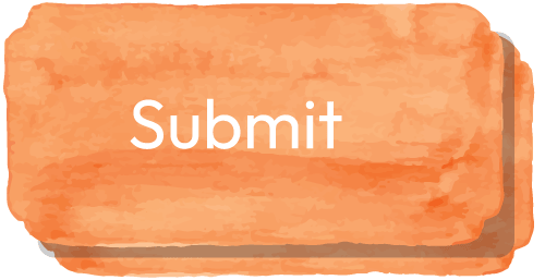
Buttons
A rectangular shape with a contrasting color and clear label (like “Submit” or “Buy Now”) strongly suggests clicking.
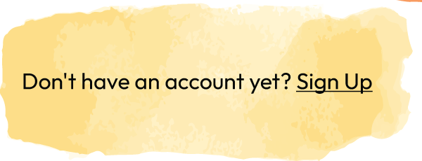
Links
Underlined text in a different color typically indicates clickable content.
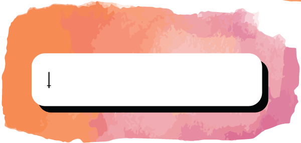
Input fields
A box with a cursor invites text input.
Pattern Affordances
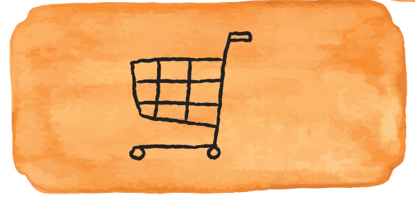
Shopping cart icon
Suggests adding items to a virtual shopping cart.
Magnifying glass
Implies a search function.

Envelope icon
Indicates email or messaging.

Metaphorical Affordances
Hamburger menu icon
A common pattern representing a navigation menu.

Dropdown arrows
Suggest expanding options.

Negative Affordances
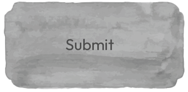
Disabled buttons
A grayed-out appearance indicates an unavailable action.
Locked elements
A padlock icon suggests restricted content.

![]() Always test your affordances with real users.
Always test your affordances with real users.
What seems obvious to a designer may not be immediately clear to end-users.
Conduct usability tests to ensure your design’s affordances align with user expectations.
In Context
Consider how buttons and icons can visually suggest their function when designing a mobile app.
For instance, a trash can icon affords deletion, while a “+” sign affords adding new content.
These small visual cues can significantly affect how easily users navigate your interface.

